Piece-by-Place


Puzzle
The Piece-by-Place puzzle and brand identity were birthed from a project I was assigned in Design Center, a Graphic Design course from Fall Semester 2022. Our class was instructed to come up with an object that could be found in a gift shop (preferably from a museum), and then to create a brand identity and application for said object. I chose to create something I was passionate about personally, which is traveling and hiking with my family, so my object would be found in a gift shop at a National Park.
Seeing how my family and I love to travel, I focused on problems that traveling families may run into. In exploring problem scenarios, I discovered that a common issue is remembering where you have been already sp you don't revisit it more than necessary or desired. I also found that people love to collect things as souvenirs from the places they have been. How great would it be if people could log the places they've been in a fun, collectable, memorable way?
My solution was the Piece-by-Place puzzle. It functions as a normal puzzle but with collectable pieces. The puzzle features the 10 most visited National Parks in the United States. User(s) collect each piece as they visit its corresponding park's gift shop, eventually gathering all and placing them together onto a board, which can be bought at any of the National Parks, to form a new, unique landscape made from other preexisting landmarks.
Now traveling families can explore new places and remember their experiences in a fun and personalized way while also bonding over building this puzzle!
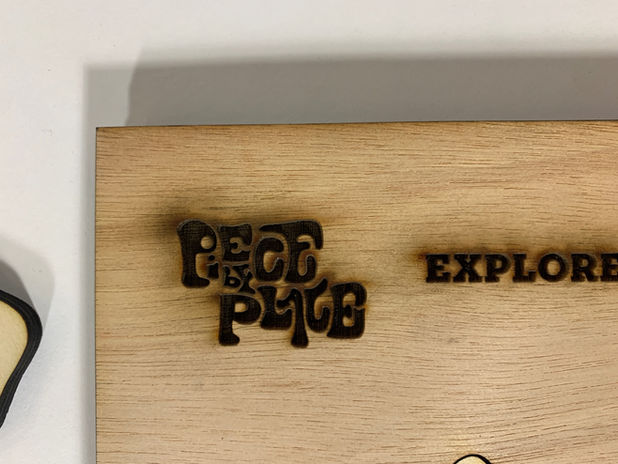
Puzzle consists of one board and 20 different puzzle pieces (2 illustration options for each National Park). The board features the Piece-by-Place logo mark, tag line, and names of the 10 National Parks. Each piece has an illustration on the front showing a common animal or landmark specific to its National Park and the name of the park engraved on the back. Seeing how people love customization, there is also an option for the user(s) to have their own photos from their travels put onto the puzzle pieces.
SKETCHES
In the beginning of my process, my plan was to have the pieces fit together to form the shape of the United States. I was going to feature the top 15 National Parks in America. The pieces were originally going to show a famous landmark that each National Park is known for as well as the name of the Park on the front, almost resembling a sticker like the ones people can purchase from National Park gift shops.
As I further developed my idea and sketches, I chose to have the pieces come together to form a new landscape out of already existing landscapes. Therefore, I changed the shape of the overall puzzle into an organic shape that resembles a large landscape. I also decided to only feature the top 10 most visited National Parks in America, because 15 was too many, and I didn't want to feature parks that weren't frequently visited since my target audience was traveling, touristy families. I also decided against having the name of each park on the front of the pieces because then it would disrupt the landscape that they come together to form, and to feature wildlife as well.


ILLUSTRATIONS
PROTOTYPES & TESTING


FINAL PUZZLE
I designed the puzzle to have two different main combinations, although there are other possible combinations. Above is are the pieces for Puzzle A, and to the right is are the pieces for Puzzle B.
The board and pieces are made out of laser-cut & engraved, sanded, and stained wood, sticker paper, modge-podge, and paint.
Above, multiple varying prototype designs and measurements, testing of different glues, and stain color testing can be seen.
I applied the illustrations to the front of the wooden pieces by printing the images on sticker paper and sticking it to the pieces' front faces. In cases where the paper overlapped the edges, I folded the excess down, sanded it, modge-podged it, and finally painted the edges.
Brand Identity


At Piece-by-Place, we promise to always offer the opportunity for families and individuals to create lifelong memories and exciting experiences exploring the vast world around us. We hope to evoke a desire to really experience and appreciate the beauty of nature and how it can bring us together.
BRAINSTORMING & SKETCHING
For Piece-by-Place, I wanted to create a brand identity that centered around the nature and travel aspect of the puzzle and the experiences it remembers.
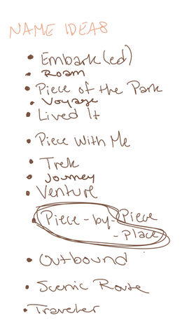
Therefore, I focused on mainly natural color schemes and symbols such as a mountain or wildlife, but also symbols that represent leaving your mark on a place, such as a footprint. Regarding the name, I was set on Lived It for a good while, representing that the user has been somewhere, not just to say they have been there, but to say they lived out an experience there.
In further development, I came up with the name Piece-by-Place, because the user is piecing a puzzle together based on the places they have been. I decided to include patterns using more wildlife and landmarks for each National Park and also footprints made from the "i" of the logo. I made the logo mark resemble puzzle pieces, and I kept the puzzle piece motif throughout the brand's visual system.
STYLE GUIDE

The logo mark is an altered Bubblegum typeface. I changed the positioning of each letter to make them appear as they are piecing together, and I added a rough texture to make it look more natural and to match the primary typeface for the brand, Sonder Slab Rough. The secondary typeface used for the body text is Freight Text Pro Book.
For the primary color scheme, I chose multiple shades of brown which would be incorporated into every design. In addition, I added 10 different color palettes, one for each National Park's illustrative pattern, based off images from the parks. These patterns would be incorporated into the packaging designs.
Packaging

SKETCHES & PROTOTYPES


FINAL PACKAGING


Regarding packaging, I designed a box for the board alone, and separate boxes varying in size and patterns for each individual piece.
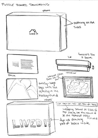
For the board box, I made a bottom box with an open top face that was slightly smaller than a top box with an open bottom face. The open face of the top box gets placed onto the open face of the bottom box to shut the box. The bottom box has an explanation of what the Piece-by-Place puzzle is and the Piece-by-Place brand promise accompanied by the logo mark. The top box has a large dye cut of the logo mark, the tag line, and which part of the puzzle it is (board) on the front, and the names of the 10 featured National Parks on the sides. Inside is the empty board and an instructional guide which explains how the puzzle works, and demonstrates the two main compositions that the pieces form. The guide also explains how the user(s) can personalize pieces with their own photos from their experience at the parks.
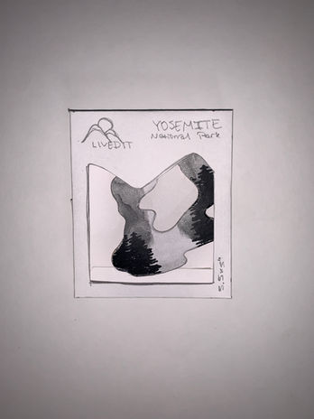
For the piece boxes, they all function in the same way with a brown sleeve sliding over a bottom piece covered with a pattern that matches the National Park the piece is for. The front of the sleeve has the Piece-by-Place logo mark, which puzzle the piece originally goes with (Puzzle A or B), a dye cut in the shape of the symbol in the illustration on that piece, and the name of the National Park it corresponds with. The back of the sleeve shows a snip-it of the subject of the illustration on the piece and a blurb explaining what it is and why it is important to the National Park. On the sides of the sleeve are the Piece-by-Place tag line and the state in which the National Park is located. Inside is a puzzle piece within its own small frame.
INSTRUCTIONAL GUIDE


App

WIREFRAMING


FINAL APP
As was previously mentioned, there is a way to customize the puzzle pieces with your own photos. The instructional guide has a QR code that can be scanned to take the user(s) to an app where they can follow an easy step-by-step guide to personalize their pieces.
Promotional Video

In addition to the puzzle, brand identity, packaging, instructional guide, and app, I also created a short, simple promotional video for the Piece-by-Place puzzle listing and featuring images from each of the 10 National Parks.


